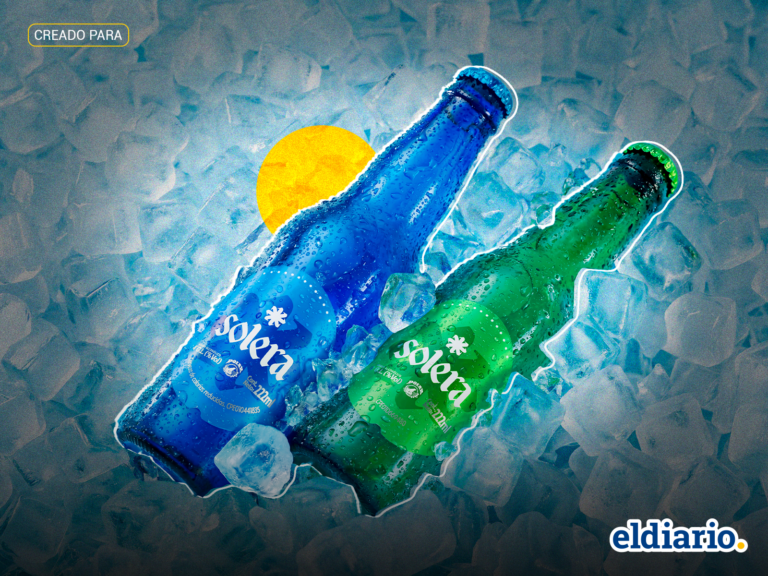
Solera renews its image: an evolution inspired by its consumers that officializes Solera Blue and Green
The Solera brand, from Empresas Polar, updates its visual identity aligning with consumer preferences with the Blue and Green versions.
TL;DR
- Solera has updated its bottle and can visual identity.
- The rebranding is inspired by consumers' organic identification of products by color ('la Azul' and 'la Verde').
- The slogan for the new image is “Con esta nueva pinta, a donde sea”.
- The change aims to strengthen Solera's premium positioning through simplified graphics.
- The quality, components, and taste of the beverage remain unchanged.
- The new visual language emphasizes minimalism, cleanliness, and freshness.
- The initiative officializes 'Solera Azul' and 'Solera Verde'.
- A comprehensive communication strategy, including traditional and digital media, is part of the launch.
- Events like 'blue Parties' and 'Bar Hopping' circuits are planned for the celebration.