Procaps presents new corporate identity and redefines its brand after 50 years in Latin America
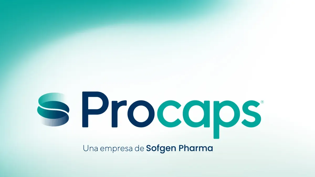
The renovation includes a new logo and updated color palette. Photo: Courtesy Procaps
TL;DR
- Procaps, a Latin American pharmaceutical company, has evolved its corporate brand identity after 50 years.
- The update features a redesigned logo, new color palette, and graphics aligned with global pharmaceutical innovation standards.
- The company aims to project science, innovation, and leadership, reflecting sustained growth in the Latin American market.
- This brand evolution is linked to scientific advancements and a future vision focused on consolidating its regional position.
- Procaps maintains presence in Latin America, developing prescription drugs, high-potency clinical solutions, OTC products, and specialized treatments, including for diabetes.
- The brand renewal is connected to operational excellence and pharmaceutical innovation as strategic pillars.
- The company stated this evolution is a clear expression of its current identity and future direction, focusing on high-quality medication and positive, sustainable health impact.
- This change goes beyond graphics, linked to a strategic agenda for sustainable results and continued access to medicines.